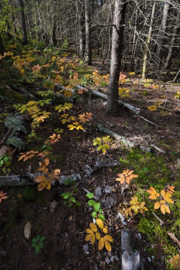
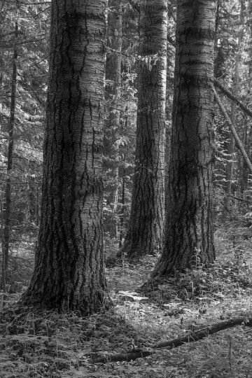
So, I’m back from my work in Fort McMurray, I’ve had a chance to rest up a bit, and I’m looking forward to resuming my project of making a new print every day. Just a simple print today from a photograph that I took early last September at the Ministik Game Bird Sanctuary. I’m headed out to Ministik tomorrow morning for the first time in a long while, and hope to come back with some new photographs that I can share here.
|
||
|
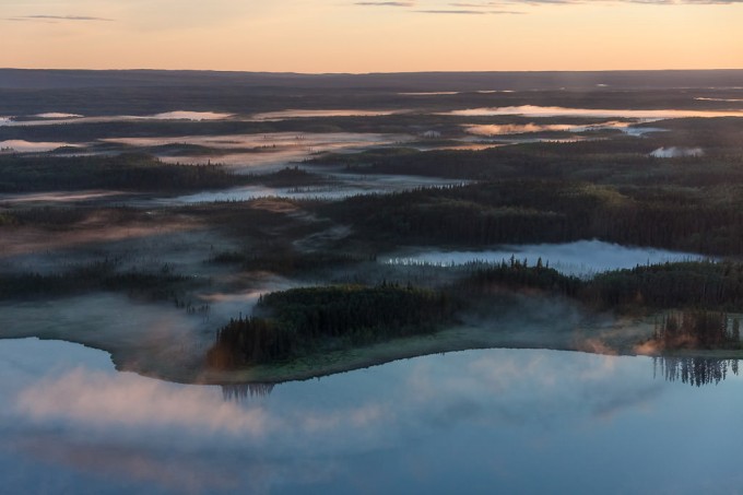
Here’s another photo that I took from the chopper on my way to work one morning last shift. It’s from a different morning as the previous photo, but from the same general area—near Namur Lake in northern Alberta (~100 km northwest of Fort McMurray). This was a tricky image to print. I tried to get the balance right between detail in the shadows, but still having the landscape dark with just the top of the fog lightening as the sun first peaks over the horizon. It was also hard to figure out the right white balance to use—the Auto WB on my camera was quite cool (very blue shadows), and setting it to Daylight WB made everything very orange-y. I set a manual balance somewhere in the middle, leaning towards cool—does anyone know a good tip for setting white balance for sunrise/sunset so accurately represent how the scene was perceived at the time? This’ll be my last post for a little while as I’m going up for another shift, but hopefully I will return with many more new photos to share! 
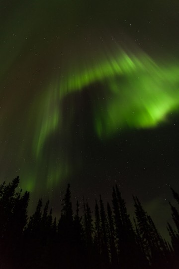
Finally—a photograph of the Aurora Borealis on borealisimages.ca! (Although, for the record, the title I’ve given these galleries—‘Silvicola borealis Images’—is derived from latin roots, and roughly translates to ‘inhabiting the northern forest’. The prefix ‘silvi’ (or ‘silva’) relates to the forest, as in ‘silviculture’ which is the practice of growing and tending a forest. ‘Borealis’ refers generally to things northern in nature, and is from ‘Boreas’ — the Greek god of the north wind.) This is definitely the darkest photo that I’ve ever printed, and I’m quite happy with the way it turned out—the print literally felt heavy with ink! On-screen, I could see a little bit of detail still in the spruce trees, but I can’t see any of that in the print yet. We’ll see if viewing it in bright daylight will reveal some of those darkest details, but otherwise I think they look fine as solid silhouettes too. I took this photo in northern Alberta while doing owl surveys this past spring. It was the first time I’d photographed the northern lights, and it was a lot of fun to try out a whole bunch of different techniques, equipment, and of course, patience… I’ll be doing a round of bat surveys in the next little while, and I hope to get the chance to apply some of what I learned this spring to making more images of these beautiful northern lights. (Click to enlarge the image—you should be able to see the stars in the full-size image too!) 
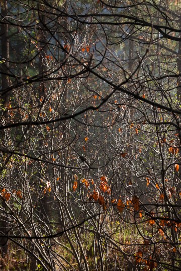
This patch of forest was pretty much the opposite of the one in yesterday’s photograph—it was a thick, messy, second-growth tangle of young pine, alder, and other shrubs. But when the fog started burning off, and the first strong rays of sun started piercing through to the forest floor it was so beautiful, it almost made up for how soaking wet I was walking through it (and it smelled amazing too!) Finding an interesting composition in the dense boreal understory is one of my favourite photographic challenges. If you’re interested in this photo, I have a portfolio of similar images entitled “Branches”. You can find it by clicking here, or following the navigation bar up top. Here’s the description that I wrote for that portfolio: “There are times when I stop while walking through the dense understory common in the boreal forest and aspen parkland to admire the complex beauty of the entwined branches, willows, grasses, and leaves. Then I bring my camera up, and as I look through the lens the complexity turns to chaos as the lens compresses the scene onto a two-dimensional plane. This is when the challenge (and fun) begins. By moving the camera a few degrees to one side, changing the focal length by a few millimeters, or opening the aperture a few stops, a composition may be found that is balanced, pleasing to the eye, and captures some of the beauty entangled in these forests.” 
This was a gorgeous forest stand to work and photograph in, and, unfortunately, a bit of an oddity to find such large, old aspens left out on the landscape. My goal printing this image was to preserve the subtlety of tone and light & shadow, but still capture some of the brilliance of this stand in the early morning light. 
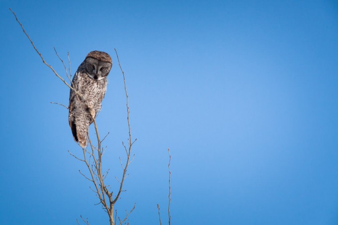
I’ve written about this image before, and I wanted to print it today, as it’s got a very distinct separation between the sharp, in-focus owl and the completely blank sky where any grain or texture is purely an artifact of sensor noise and sharpening in post-processing. As I mentioned yesterday I tried the strategy of pushing the clarity and sharpening as far as I think looked good on my monitor, before backing off a bit. Yesterday the print came out looking really good (although it had a slight greenish cast that I hadn’t noticed on-screen), so I figured I’d try it on a much less forgiving photo today. We’ll see how it turns out… 
I’m writing this post as my printer churns away on this one, and I’m really interested to see how it turns out. I’ve often heard it recommended to push a given processing technique a little too far, and then ease back a little. By doing this, you discover the limit of the technique without crossing it. This sounds reasonable in practice, but I fear that you then have all your images at the edge of what’s acceptable, and perhaps sacrifice some subtlety. A certain subtley, is often harder to notice at the moment that you’re working on an image in Lightroom, but can easily be essential to making a good image a great image. I guess the goal is to be able to recognize when an image requires that subtlety, and to make sure that you’re not crossing that line. So with that in mind, I picked this photo (which, although I quite like it, I don’t think is very subtle at all) and pushed the clarity and sharpness to the limit of what I thought looked good on my screen. Once the print is finished, it’ll be interesting to see how well (or not) that translated on to paper. 
|
||
|
Copyright © 2009-2026 Jonathan Martin-DeMoor |
||

