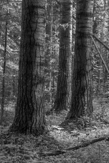
This was a gorgeous forest stand to work and photograph in, and, unfortunately, a bit of an oddity to find such large, old aspens left out on the landscape. My goal printing this image was to preserve the subtlety of tone and light & shadow, but still capture some of the brilliance of this stand in the early morning light.
|
||
|
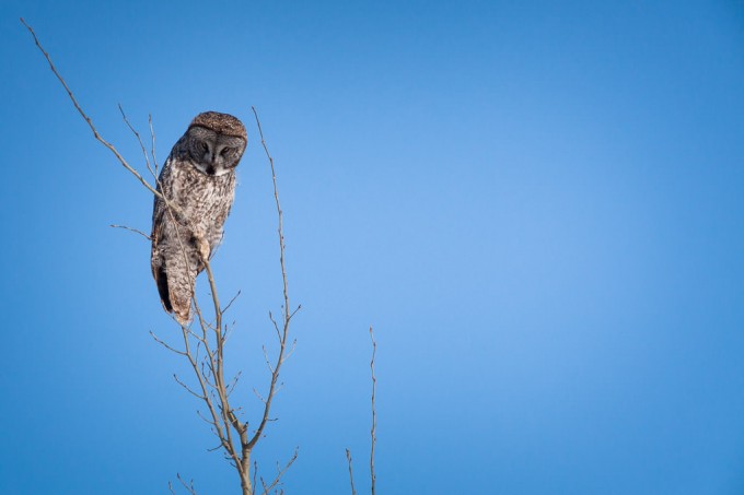
I’ve written about this image before, and I wanted to print it today, as it’s got a very distinct separation between the sharp, in-focus owl and the completely blank sky where any grain or texture is purely an artifact of sensor noise and sharpening in post-processing. As I mentioned yesterday I tried the strategy of pushing the clarity and sharpening as far as I think looked good on my monitor, before backing off a bit. Yesterday the print came out looking really good (although it had a slight greenish cast that I hadn’t noticed on-screen), so I figured I’d try it on a much less forgiving photo today. We’ll see how it turns out… 
I’m writing this post as my printer churns away on this one, and I’m really interested to see how it turns out. I’ve often heard it recommended to push a given processing technique a little too far, and then ease back a little. By doing this, you discover the limit of the technique without crossing it. This sounds reasonable in practice, but I fear that you then have all your images at the edge of what’s acceptable, and perhaps sacrifice some subtlety. A certain subtley, is often harder to notice at the moment that you’re working on an image in Lightroom, but can easily be essential to making a good image a great image. I guess the goal is to be able to recognize when an image requires that subtlety, and to make sure that you’re not crossing that line. So with that in mind, I picked this photo (which, although I quite like it, I don’t think is very subtle at all) and pushed the clarity and sharpness to the limit of what I thought looked good on my screen. Once the print is finished, it’ll be interesting to see how well (or not) that translated on to paper. 
I’m trying to print a wide range of photos as I start up on my Daily Print project to give myself a feel for what kinds of prints I’m fairly good at making already, and which areas I could use more practice. I’m also trying to use a range of tools and techniques that I haven’t used before, to try to add them to my regular workflow to be used as required. This image showed just a hint of “green fringing” chromatic abberation, so I tried out Lightroom 4.1’s new “Defringe” controls. I don’t know if the slight fringing would have been noticeable in a print originally, but it sure wasn’t after a little bit of extra tweaking. Cool. 
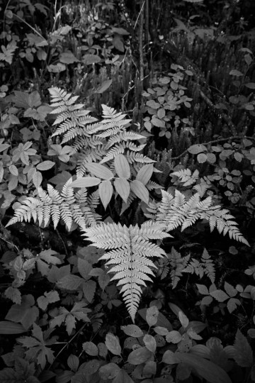
A good friend of mine, an old BC Parks naturalist, shared with me the following short verse that I am always reminded of when I come across ferns like the ones in this photo: 
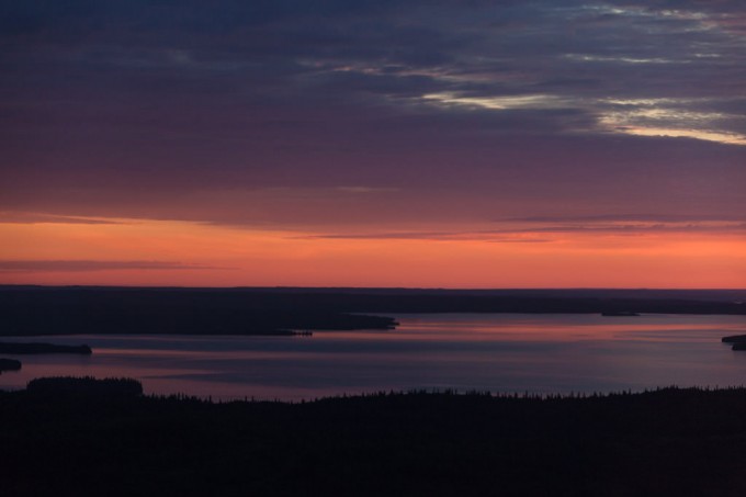
I took this photo on my way to work earlier this summer—I just happened to be lucky enough to be commuting in a helicopter out to a gorgeous old-growth boreal mixedwood site about 100km north-west of Fort McMurray to do bird surveys for the morning! It was a neat experience to get to spend so much time flying over the boreal landscape that I know so well from the ground, and to get a bit of a different perspective on things. I’m sure I’ll print and share here a few more photos from my past couple shifts up there. I notice when I look through my photo archives, that my colour palette tends to be rather subdued, even sombre at times. If I then look through the photographs made by other photographers that I’ve marked as my favourites, (primarily on the terrific photography-sharing website 500px.com (here’s my 500px collection and my favourites from other 500px photographers)) I notice that the overall impression is very similar—I guess it turns out that’s just what I’m most drawn to… So, for today’s print I decided to choose an image with a bit of colour. I chose this photo in particular because of the bright, highly saturated orange/red band on the horizon. When Lightroom 4 was released (the software I use for 95% of my processing), I’d read about its new soft-proofing ability (here’s another good article as a pdf), but never actually used it before. I was pretty sure the intense warm colours in this image would be out of gamut for my printer and paper combo that I’m using for this Daily Print project (an Epson 3880 and Canson Baryta Photographique). Sure enough, Lightroom was showing me clipping warnings, but with just a little finessing (lower saturation and highlights, increase vibrance and contrast, tweak tone curve, etc), I got it looking good, and not showing any clipping. I ran the print off, and was quite impressed how closely the print matched my monitor. I’m looking forward to seeing the print in the daylight tomorrow… 
|
||
|
Copyright © 2009-2026 Jonathan Martin-DeMoor |
||

