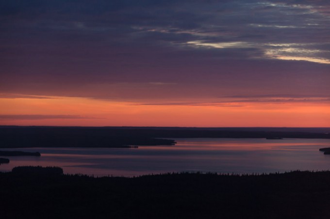
 Sunrise over Namur Lake I took this photo on my way to work earlier this summer—I just happened to be lucky enough to be commuting in a helicopter out to a gorgeous old-growth boreal mixedwood site about 100km north-west of Fort McMurray to do bird surveys for the morning! It was a neat experience to get to spend so much time flying over the boreal landscape that I know so well from the ground, and to get a bit of a different perspective on things. I’m sure I’ll print and share here a few more photos from my past couple shifts up there.
I notice when I look through my photo archives, that my colour palette tends to be rather subdued, even sombre at times. If I then look through the photographs made by other photographers that I’ve marked as my favourites, (primarily on the terrific photography-sharing website 500px.com (here’s my 500px collection and my favourites from other 500px photographers)) I notice that the overall impression is very similar—I guess it turns out that’s just what I’m most drawn to… So, for today’s print I decided to choose an image with a bit of colour.
I chose this photo in particular because of the bright, highly saturated orange/red band on the horizon. When Lightroom 4 was released (the software I use for 95% of my processing), I’d read about its new soft-proofing ability (here’s another good article as a pdf), but never actually used it before. I was pretty sure the intense warm colours in this image would be out of gamut for my printer and paper combo that I’m using for this Daily Print project (an Epson 3880 and Canson Baryta Photographique). Sure enough, Lightroom was showing me clipping warnings, but with just a little finessing (lower saturation and highlights, increase vibrance and contrast, tweak tone curve, etc), I got it looking good, and not showing any clipping. I ran the print off, and was quite impressed how closely the print matched my monitor. I’m looking forward to seeing the print in the daylight tomorrow…
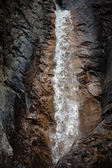
 Silverton Falls textures Speaking of shutter speeds and water texture, for this image I used a fast shutter speed (1/640th sec at f/8) to freeze the motion of the falling water. It’s interesting to me that you can see how the water was accelerating as it fell—the texture gets blurrier near the bottom of the fall. I also like how the texture of the water matches the patterns in the rock faces surrounding the falls.
For printing this photo, I tried to make sure to retain detail in the shadows and in the highlights while maintaining the high-contrast nature of the scene. In the final print I did notice the highlights wash out just a bit in one spot of water (far right, about 2/3rds down), and when I checked the image on my monitor it also showed almost no detail, although it was not quite clipped. Funny how I didn’t notice it as a problem on-screen, but it stood out in the print immediately. Lesson learned…
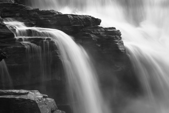
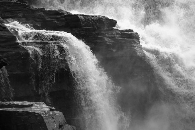
After my previous post “Athabasca Falls in black and white” with the motion of the water captured with a slow shutter speed to give a streaked effect, I remembered that I had also captured some video on that morning. So—for your interest’s sake—here is: a short video clip of Athabasca Falls shot at 30 fps with a shutter speed of 1/30th of a second at f/16; a still photo of the same composition captured at 1/5th of a second at f/8 and iso400 (the same settings as the image in my previous post); and a photo captured at 1/125th of a second (which I’ve been told best captures how our eyes/brains see motion) at f/9 and iso800.
 Athabasca Falls II (1/5th sec)  Athabasca Falls III (1/125th sec)
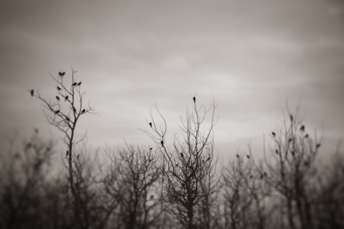
 Blackbird flock in bare trees I recently received a request from a woman to use this photograph in a blog post she’s writing, which gave me the great excuse to re-visit this image and to share it here (it hasn’t made it into the new website yet, but watch for it in the Birds section of my catalogue, hopefully in the next few months).
I took this photo near the Beaverhill Bird Observatory near Tofield, AB in the spring of 2007. At the time, I was experimenting with defocusing images, or portions thereof, for creative effect. In this case, the original image was mostly sharp, and I “painted in” the blurred effect in post-processing. I was inspired to try this technique by another photographer who would create the same effect in the darkroom by spilling chemicals over the drying print and using a brush or sponge to blur the image.
It’s always fun to try new techniques, and although I haven’t taken many defocused photographs lately, you can view a selection of these images in my “Boreal Impressions” portfolio. I’d also recommend having a look at William Neill’s “Impressions of Light” portfolio for more great blurry images that were an inspiration to me (although he achieves the effect mostly through long shutter speeds and camera movement, rather than manually defocusing the lens).
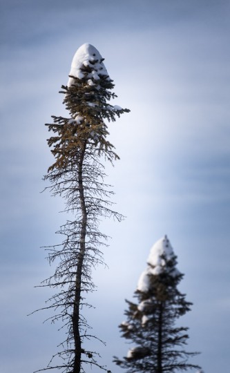
 Snow cap on thin black spruce After receiving huge amounts of new snow over the past few weeks, we finally got a day where the sun managed to peak—weakly—through the clouds for a few hours. Since I was already on the west side of town, I decided to head out to the Wagner Natural Area where, I hoped, the dense spruce trees covered in deep snow would provide an interesting photographic opportunity or two.
It was more challenging than I expected—the huge amount of snow often looked like just a big pile slumped over everything, rather than contrasting or complimenting the forms of the trees. But a challenge can be good fun, and I did get a couple images that I’m quite happy with—I’ll share some more over the next little while.
 Non-vignetted The processing in this one was inspired by an image by a local photographer who I’ve mentioned before, Joel Koop. He posted an image on his blog that was heavily vignetted (darkened in the corners) in post-processing—and it looked great. I had already processed this one with a little bit of vignetting, but his image inspired me to try pushing it a bit further, and I think I like it this way. What do you think? (I’ve included the non-vignetted version here for comparison—use your arrow keys to switch between versions.)
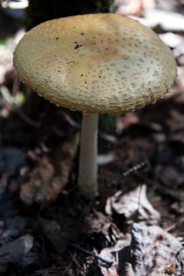
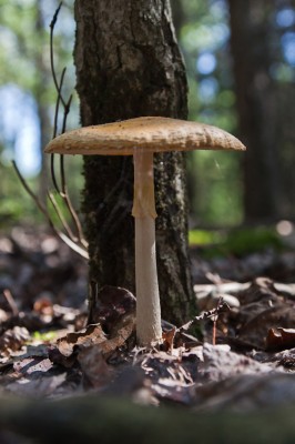
 Amanita mushroom from above  Amanita mushroom 
In my last post, I didn’t say much about the photographs themselves, as they were more documentary than artistic in nature, but perhaps one thing I’ll mention, as something for you to try out if you haven’t already, is that for the first time I used the “Live View” function on my DSLR to get down really low beside these mushrooms for an interesting perspective (e.g. the puffball, and the amanita).
Live View (i.e. framing the photo using the LCD on the back of the camera) has been common on point-and-shoot cameras for a long time, but is just being introduced on SLR cameras in the past few years. However, I still find myself using the optical viewfinder for everything except shooting video—just old fashioned I guess (although in my defence, I think the form factor of a DSLR does not lend itself to being held at arms’ length, especially with a longer lens attached). In this case though, by using the Live View, I could basically have the camera and lens on the ground, and still compose a decent image even though I was also carrying my daughter in a big backpack. You can see the difference in two photos above, the one on the left I made looking through the viewfinder while crouching as low as possible, and the one on the right is taken in the same posture, but using the LCD on the back of the camera to compose the image.
Using Live View (or whatever your camera’s maker calls it) for this type of otherwise awkward shot is definitely a trick that I will keep in mind for the future, and recommend to others for those moments where the unusual angle is tempting, but laying prostrate just isn’t.
|
(Click photos to enlarge)
|

