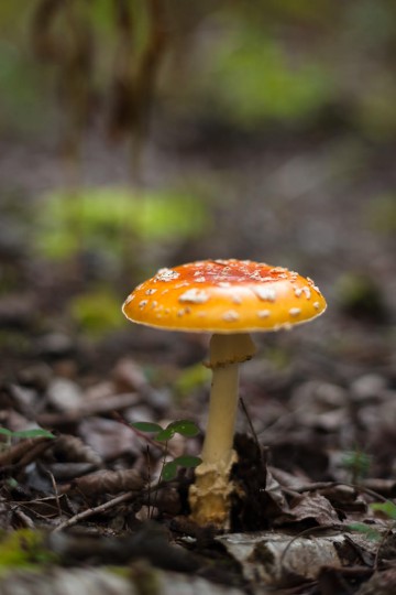
 Fresh amanita mushroom Almost exactly two years ago (less one day), I had the opportunity to photograph a tremendous diversity of mushrooms at Ministik (click here to view a gallery of images). Today, I went back to the same spot and, while the diversity was much lower than the previous year, there were some great mushrooms out—and I had a great time photographing a few of them. This is a very fresh, still growing “Fly Agaric” or “Fly Amanita” mushroom (Amanita muscaria). Beautiful to look at—and photograph—but don’t eat it!
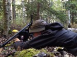
 me photographing mushroom For most of the morning, I used my 50mm f/1.4 and flipped the centre column of my tripod upside down to make low-angled, shallow depth-of-field photographs of these mushrooms. I see mushrooms like this often while doing field work, but rarely have the time to take deliberate, careful photos of them. I’ll share a couple more from this morning in the next little while, so please come back again soon. (Here’s a quick photo of my hard at “work” this morning…)
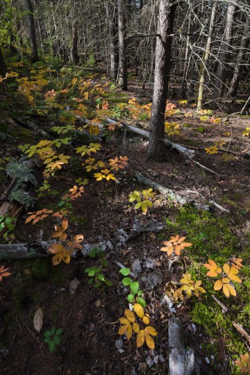
 First fall colour So, I’m back from my work in Fort McMurray, I’ve had a chance to rest up a bit, and I’m looking forward to resuming my project of making a new print every day. Just a simple print today from a photograph that I took early last September at the Ministik Game Bird Sanctuary. I’m headed out to Ministik tomorrow morning for the first time in a long while, and hope to come back with some new photographs that I can share here.
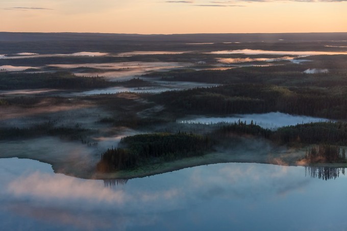
 Morning fog over boreal lakes Here’s another photo that I took from the chopper on my way to work one morning last shift. It’s from a different morning as the previous photo, but from the same general area—near Namur Lake in northern Alberta (~100 km northwest of Fort McMurray).
This was a tricky image to print. I tried to get the balance right between detail in the shadows, but still having the landscape dark with just the top of the fog lightening as the sun first peaks over the horizon. It was also hard to figure out the right white balance to use—the Auto WB on my camera was quite cool (very blue shadows), and setting it to Daylight WB made everything very orange-y. I set a manual balance somewhere in the middle, leaning towards cool—does anyone know a good tip for setting white balance for sunrise/sunset so accurately represent how the scene was perceived at the time?
This’ll be my last post for a little while as I’m going up for another shift, but hopefully I will return with many more new photos to share!
 Colourful mixedwood trunks I’m writing this post as my printer churns away on this one, and I’m really interested to see how it turns out. I’ve often heard it recommended to push a given processing technique a little too far, and then ease back a little. By doing this, you discover the limit of the technique without crossing it. This sounds reasonable in practice, but I fear that you then have all your images at the edge of what’s acceptable, and perhaps sacrifice some subtlety. A certain subtley, is often harder to notice at the moment that you’re working on an image in Lightroom, but can easily be essential to making a good image a great image. I guess the goal is to be able to recognize when an image requires that subtlety, and to make sure that you’re not crossing that line.
So with that in mind, I picked this photo (which, although I quite like it, I don’t think is very subtle at all) and pushed the clarity and sharpness to the limit of what I thought looked good on my screen. Once the print is finished, it’ll be interesting to see how well (or not) that translated on to paper.
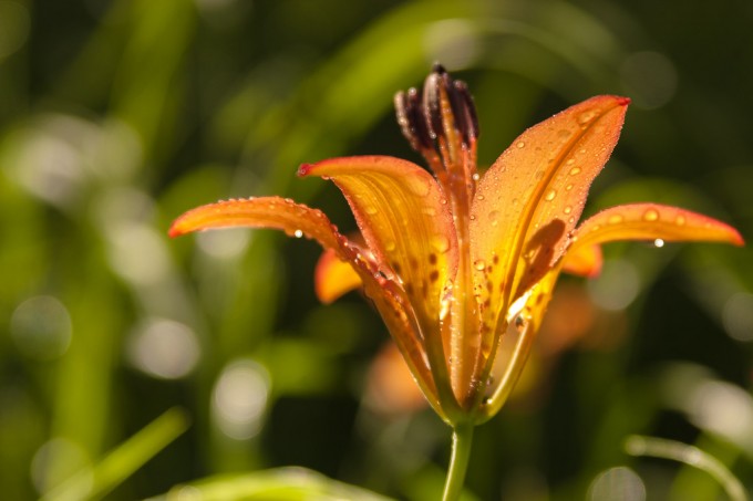
 Fresh rain on summer Tiger Lily This one is for my wife today.
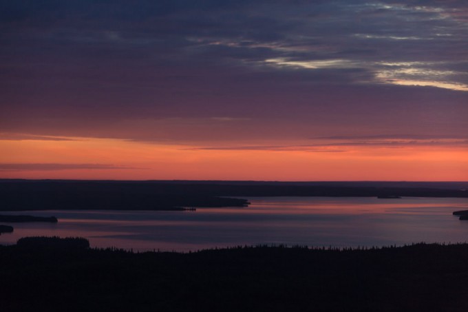
 Sunrise over Namur Lake I took this photo on my way to work earlier this summer—I just happened to be lucky enough to be commuting in a helicopter out to a gorgeous old-growth boreal mixedwood site about 100km north-west of Fort McMurray to do bird surveys for the morning! It was a neat experience to get to spend so much time flying over the boreal landscape that I know so well from the ground, and to get a bit of a different perspective on things. I’m sure I’ll print and share here a few more photos from my past couple shifts up there.
I notice when I look through my photo archives, that my colour palette tends to be rather subdued, even sombre at times. If I then look through the photographs made by other photographers that I’ve marked as my favourites, (primarily on the terrific photography-sharing website 500px.com (here’s my 500px collection and my favourites from other 500px photographers)) I notice that the overall impression is very similar—I guess it turns out that’s just what I’m most drawn to… So, for today’s print I decided to choose an image with a bit of colour.
I chose this photo in particular because of the bright, highly saturated orange/red band on the horizon. When Lightroom 4 was released (the software I use for 95% of my processing), I’d read about its new soft-proofing ability (here’s another good article as a pdf), but never actually used it before. I was pretty sure the intense warm colours in this image would be out of gamut for my printer and paper combo that I’m using for this Daily Print project (an Epson 3880 and Canson Baryta Photographique). Sure enough, Lightroom was showing me clipping warnings, but with just a little finessing (lower saturation and highlights, increase vibrance and contrast, tweak tone curve, etc), I got it looking good, and not showing any clipping. I ran the print off, and was quite impressed how closely the print matched my monitor. I’m looking forward to seeing the print in the daylight tomorrow…
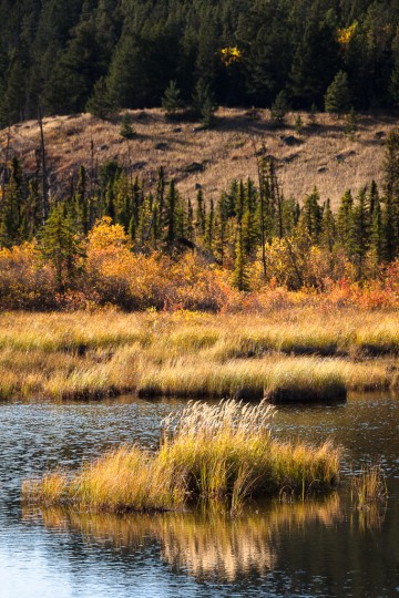
 Marsh grass in mountain lake It has been a long time since I’ve posted much here—my apologies—but it should get better again shortly…
I have decided to try “The Online Photographer” Mike Johnston’s “Specific, Detailed Program for Absolutely, Positively Getting Better as a Digital Printmaker”. In short, this is an exercise to get in the habit of working on my photography daily, for a few minutes at least, and to start practicing making prints of my work. I tend to make a few prints occasionally if I’m really excited about a new batch of photos, and a stack of prints for craft sales, etc. The emphasis of the SDPFAPGBAADP program (nice acronym…) is to just practice processing and making prints in a low pressure kind of way.
I’ll give it a try for a while, hopefully I can find the time most days and really get in the habit. If I have a little extra time, I’ll post the day’s photo here too—it should be an interesting mix of images, and I hope you’ll enjoy seeing them. I just printed the photo above, which I took on a trip to Jasper National Park with the family last fall. I have rarely experienced a more pleasant and photogenic evening than this—the fall colours were in their prime, the temperature cool but the breeze warm, and the family was patient… perfect.
And, as always, I appreciate your feedback—please feel free to leave me a comment with your comments or critiques!
|
(Click photos to enlarge)
|

