 Colourful mixedwood trunks I’m writing this post as my printer churns away on this one, and I’m really interested to see how it turns out. I’ve often heard it recommended to push a given processing technique a little too far, and then ease back a little. By doing this, you discover the limit of the technique without crossing it. This sounds reasonable in practice, but I fear that you then have all your images at the edge of what’s acceptable, and perhaps sacrifice some subtlety. A certain subtley, is often harder to notice at the moment that you’re working on an image in Lightroom, but can easily be essential to making a good image a great image. I guess the goal is to be able to recognize when an image requires that subtlety, and to make sure that you’re not crossing that line.
So with that in mind, I picked this photo (which, although I quite like it, I don’t think is very subtle at all) and pushed the clarity and sharpness to the limit of what I thought looked good on my screen. Once the print is finished, it’ll be interesting to see how well (or not) that translated on to paper.
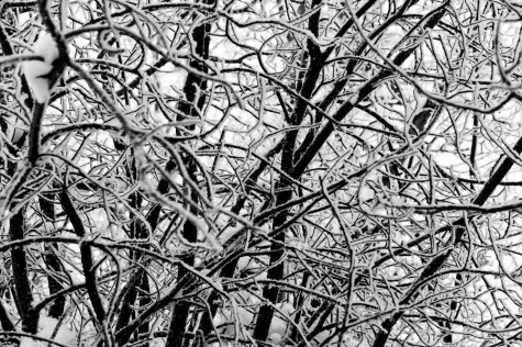
 Tangle of winter branches II Here’s another detail-oriented image taken during our recent spell of grey, overcast winter days. As I mentioned in a previous post, when the light is diffused so evenly by the low, bright stratus clouds that are common over central Alberta in the winter (especially the past few weeks), it’s often these close-up, detail oriented compositions that I find work best.
I don’t commonly convert images to black and white, and even less often do I process them quite as heavily as I have here. While the contrast was fairly strong to begin with, I’ve “crushed” the darks all the way down, and bumped the background sky all the way up, to really emphasize the somewhat abstract pattern of the tangled branches, accentuated by the lining of snow and frost. Perhaps I’ll also post the original version as well, and I would love to hear your comments as to which you prefer.
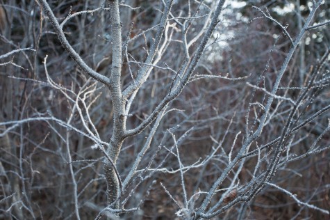
 Light frost on aspen sapling Here’s another photo from my recent early morning walk at Whitemud Ravine. This photo is much more monochromatic than the one I posted yesterday, and perhaps captures the cold, frosty feel of the morning better. I made this photograph perhaps twenty minutes after the last photo, but this sapling was shaded in behind some large white spruce trees which are visible in the background. What do you think? Do you prefer this one or the previous, more colourful photo? I always appreciate the feedback, you can just click the “Leave a comment” link below–Thanks!
|
(Click photos to enlarge)
|


